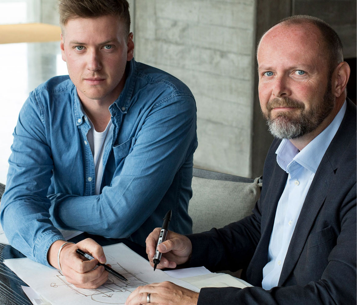
Architects Ben and John had a shared passion for producing bespoke, imaginative architecture that harmonises with its environment which led to a profound partnership together.
Each brought their unique stories, experiences, and complementary design skills to the table. Their mission was clear: to create stunning, warm, inviting, and sustainable architecture that stood out in the field.
Ben and John’s journeys, experiences, and design skills were distinctive. They recognised the value of this diversity in perspective and aimed to offer their clients more by integrating these varied viewpoints. It was a meeting of mindsets to build better homes, and this collaborative approach produced design subtleties that continually surprised and delighted their clients.

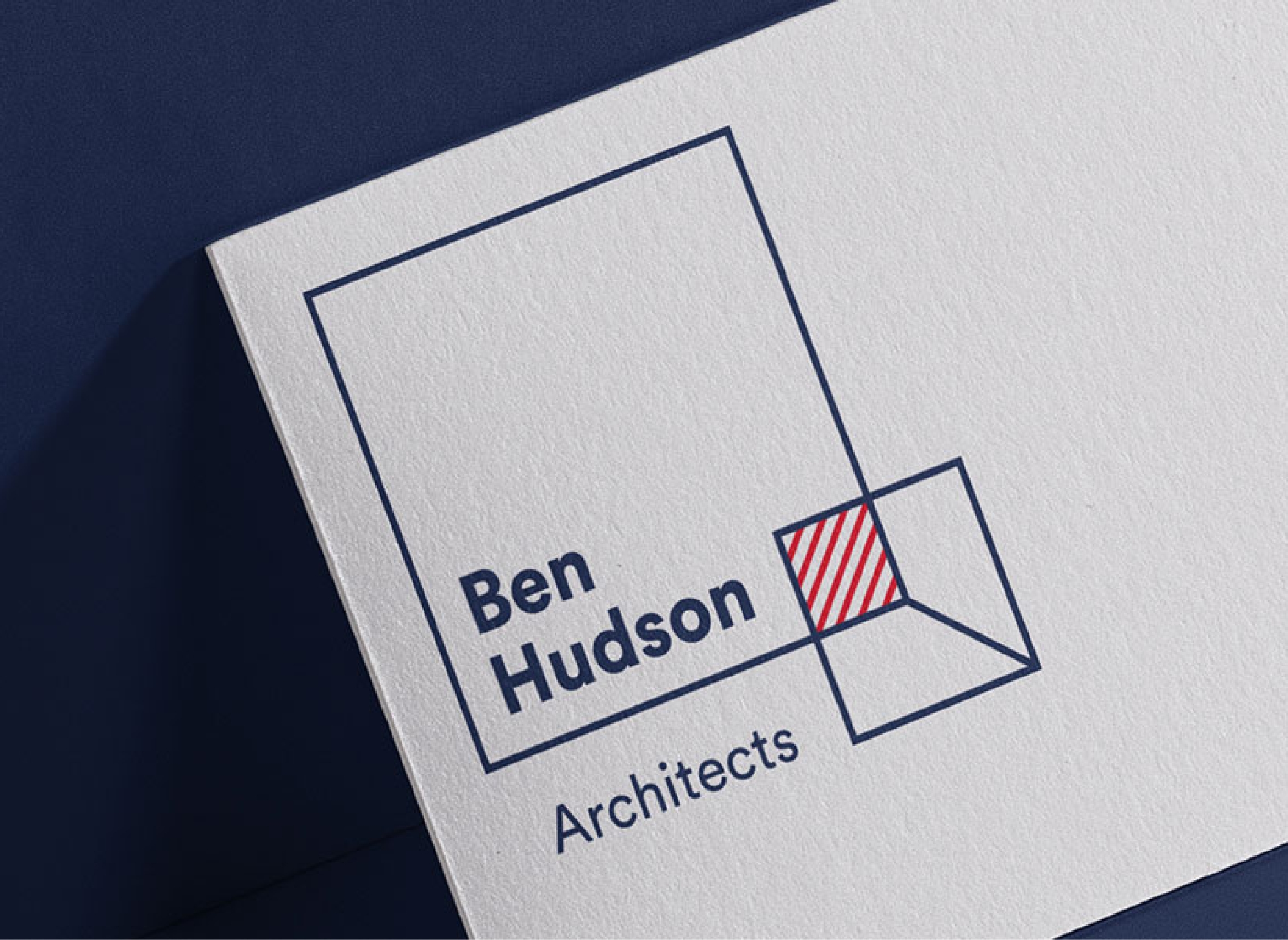
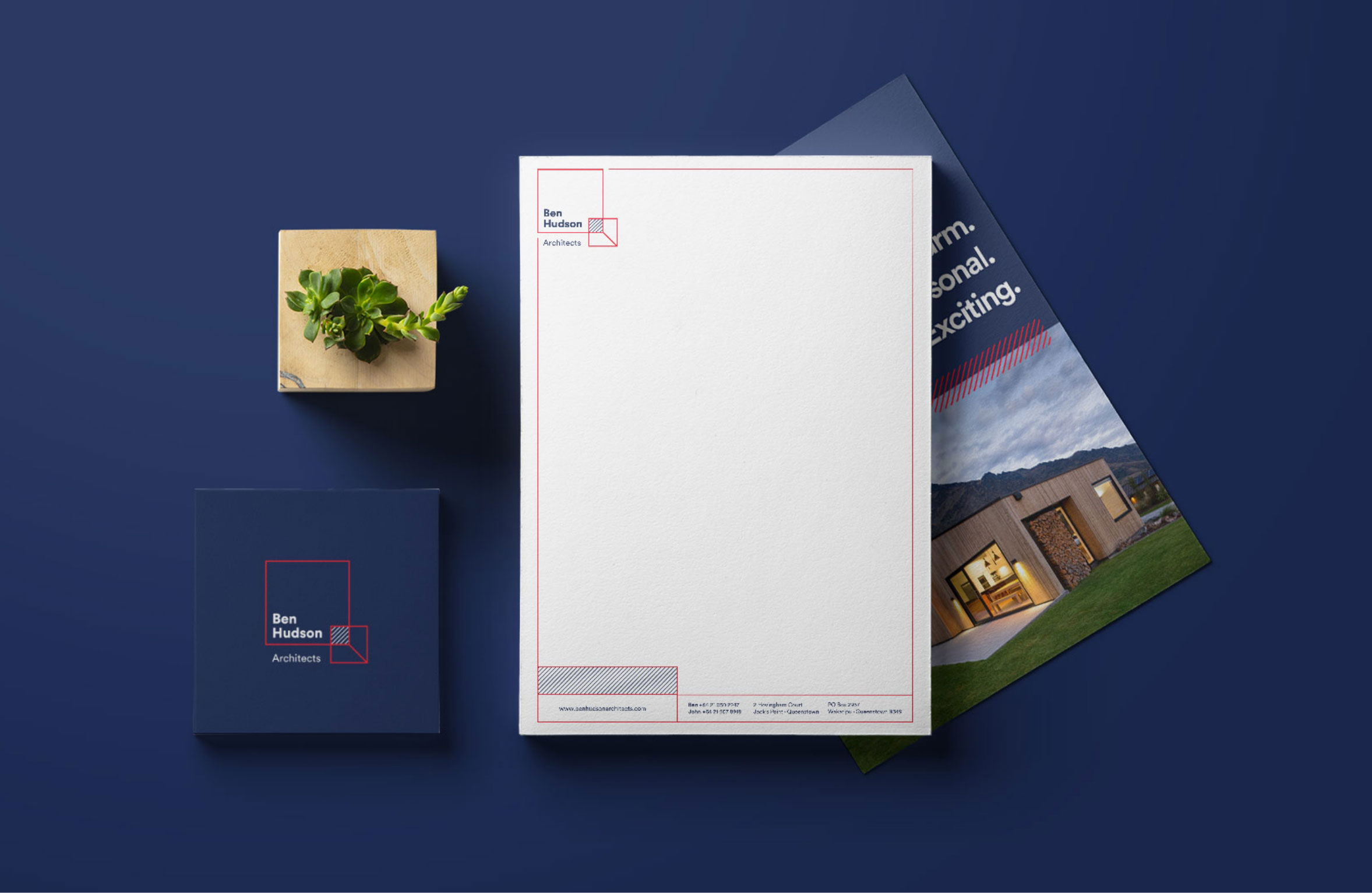
The brand identity and logo design centered around the concept of duality and complementary forces coming together to create a unique expertise that was second to none.
This idea was visually communicated through an animated version of the brand, which was designed for digital use. The logo and brand design played a pivotal role in telling the story of their architectural approach.
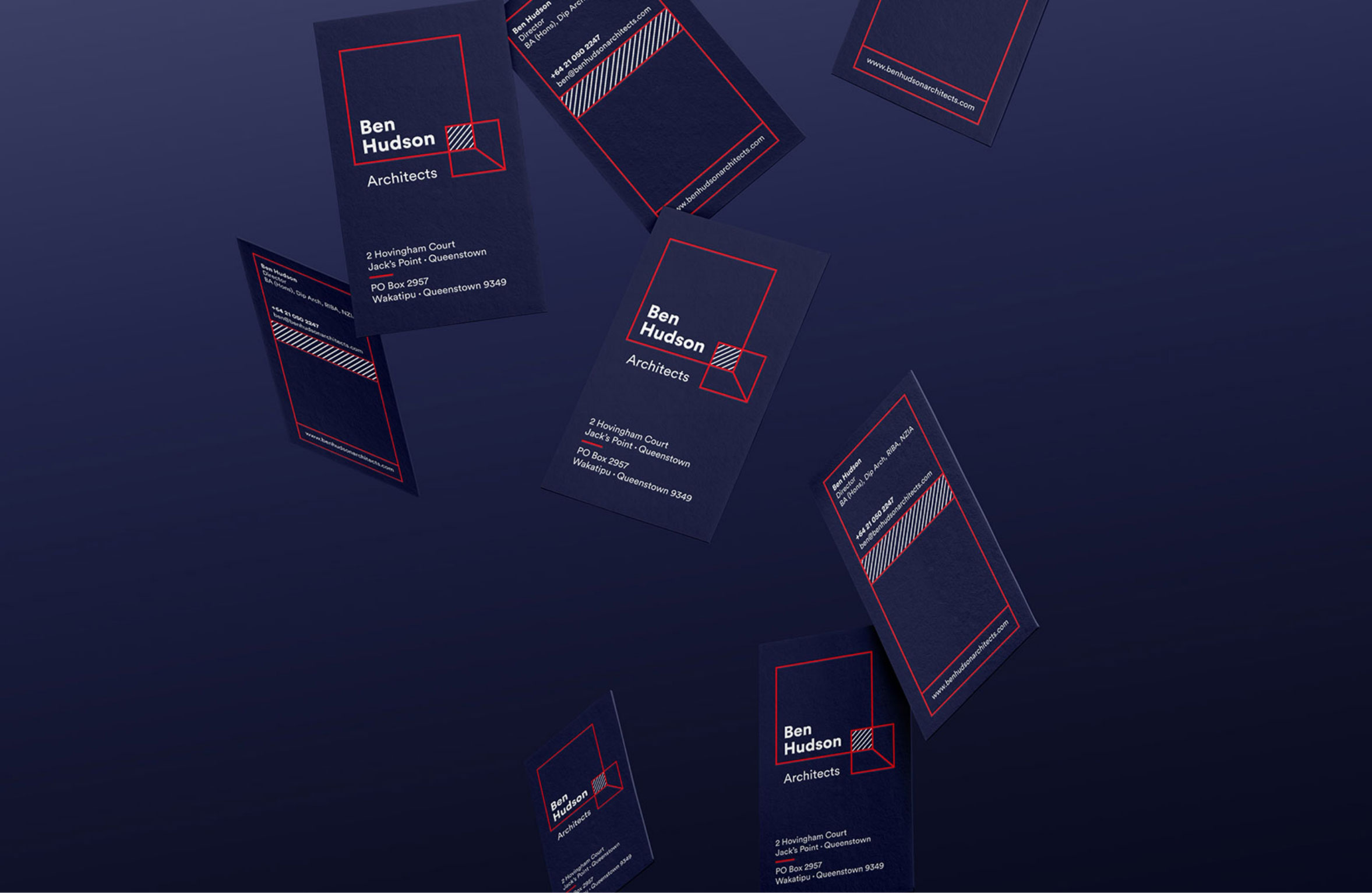
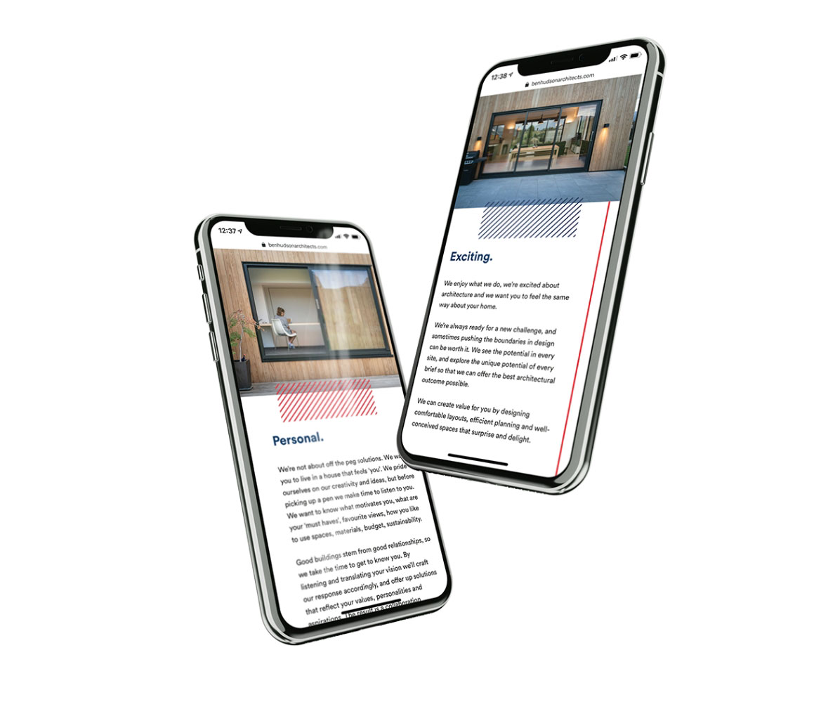
A complementary graphical identity system paid tribute to the lines in the logo and was implemented as a flexible design system across all marketing materials and the website. These lines did more than create structure; they evolved and built upon themselves as users journeyed through the website, symbolising the ever-evolving nature of their architecture.
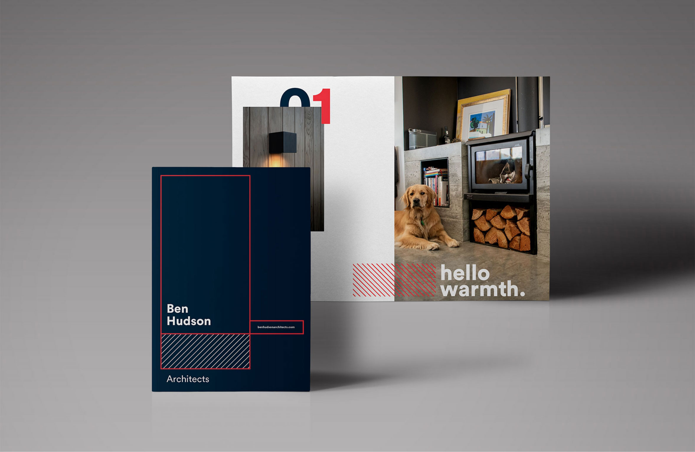
The bold use of red in their branding contradicted the perception of a cold and stiff architectural firm. Ben Hudson Architects didn’t just design spaces; they designed for feelings, moments, and memories. Their goal was to create spaces that told an ever-changing story and made people feel better.
By articulating their unique approach and showcasing it through a compelling brand identity and website, Ben Hudson Architects were able to establish a distinctive position in the architectural landscape.
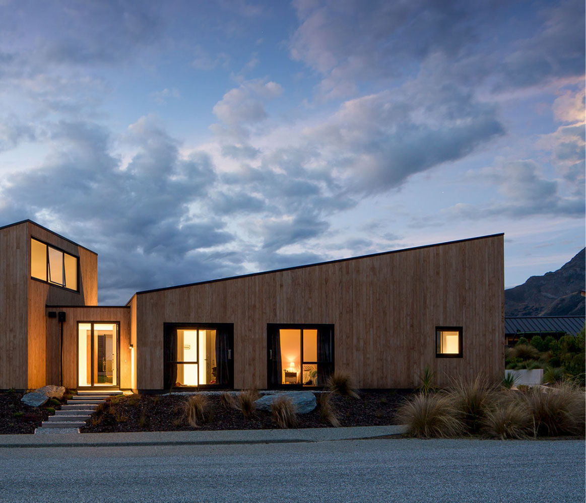
In a market saturated with ultra-modern, minimalist, and often aloof architectural firms, Ben Hudson Architects had an approach that was warm, inviting, and aimed at capturing the audience they set out to attract. Their warm, inviting, and innovative brand attracted the perfect audience, helping them stand out in a competitive industry. Their architecture was not just about structures; it was about creating spaces that resonated with emotions and experiences, making people feel better.
The brand’s visual elements, including the logo, graphical system, and bold use of red, were essential in communicating the essence of Ben Hudson Architects’ approach. This, in turn, led to an increase in brand recognition and a greater affinity with their target audience.
"
What we like about Kim and Maranda is that they wanted to hear our story and what we’re trying to accomplish. They get what we’re about, and have embedded this flawlessly into our brand. Their team have created us a visual identity and design that talks about who we are as Architects, and absolutely fits our needs.
Ben, Director