Founded by Carmen Hubber, Hub Design’s unmatched style and approach to interior design work can be uniquely identified amongst her competitors.
Hub Design is a bespoke interior design firm in Queenstown, New Zealand, focusing on large scale residential home fit-outs for regional and international clientele. Individuality is her most valuable asset and she approached us because her brand image wasn’t communicating that to the world.
Although Hub Design works across many budget ranges, during our Seed™ brand strategy session, we knew Carmen wanted to focus on higher net worth projects that utilise her full capabilities. They are not only the most profitable but the most rewarding. When she’s able to have a hand in the entire process of home design, results are typically better and all the elements of the home are much more cohesive.
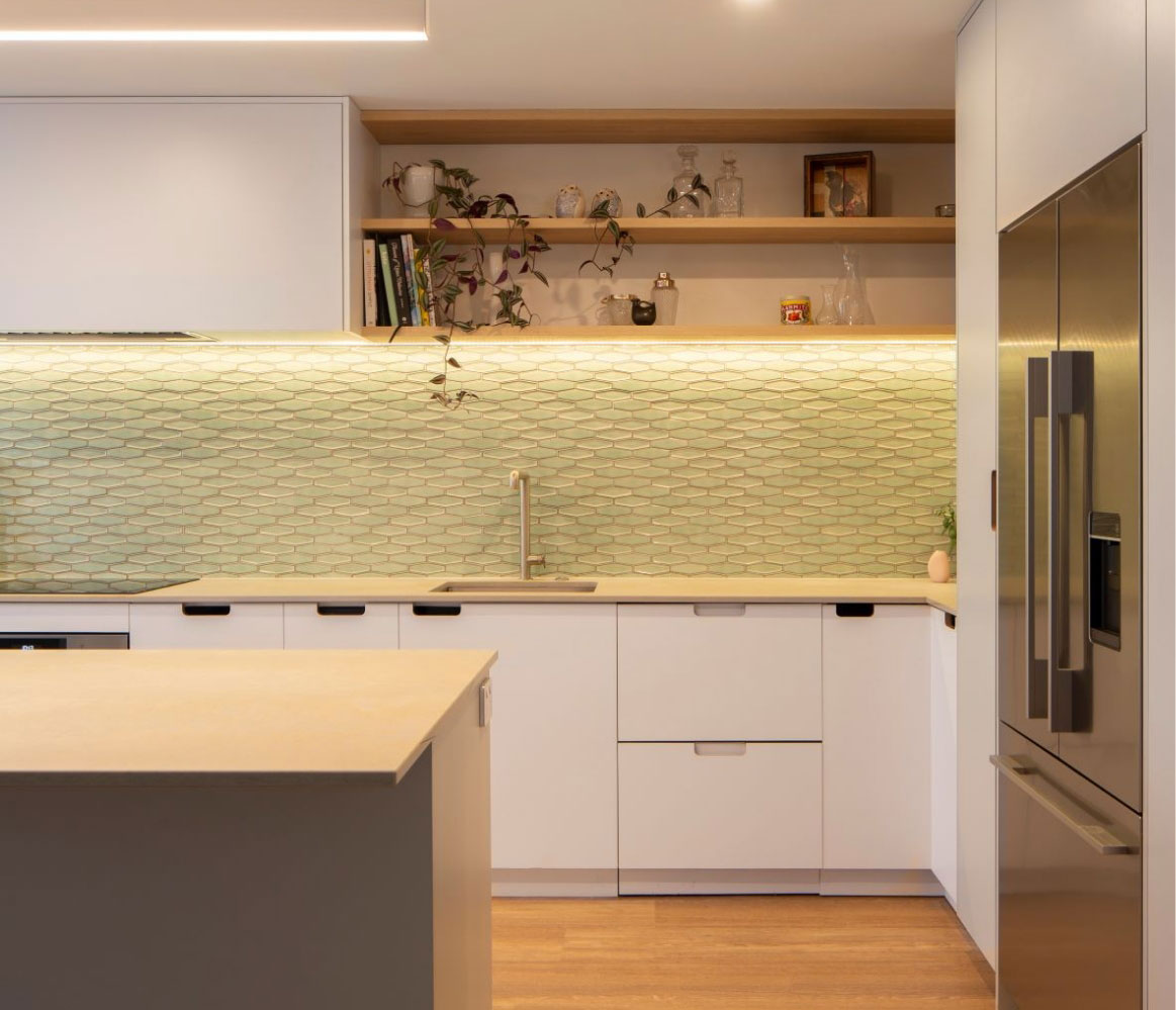
Get to know Carmens work and you’ll soon be spotting it, without even a hint. She has the ability to source furniture and finishings you couldn’t dream of, and definitely ones that will make the neighbours jealous.
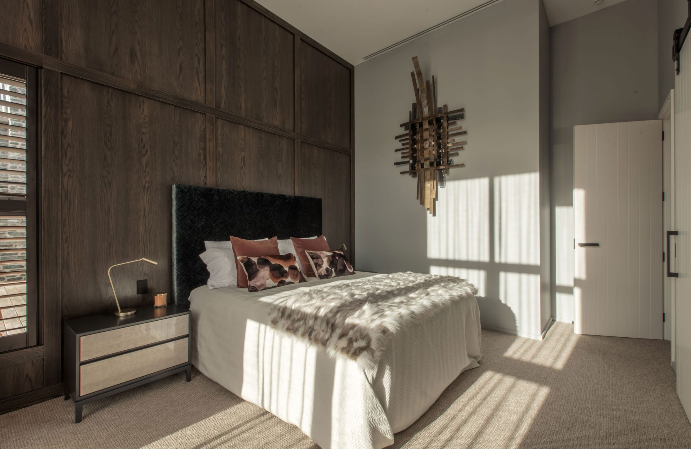
Interior design, and we mean really good interior design definitely has the power to reflect a certain level of status or prestige. It’s something we know our target audience cares about. What do they want more than a comfortable sofa and imported kitchen tiles? They want carefully curated artwork that reflects their own taste and personality. They want a beautiful home they might see in Home Style Magazine but one they can actually live in. These are all emotional insights we gathered about her audience through research and discovery.
In order to really get the full experience of Hub Design you really have to meet the founder. Carmen is so full of character, individuality and confidence. One consult with Carmen and you know she’s the right expert for the job. Our challenge was to communicate this authenticity throughout all her brand touch points.
Designing for a designer is no easy task. Market research reveals many competitors in the interior design space opted for the overly clean and minimalist brand image. Everything Hub Design creates is to make a statement (that’s our kind of design company). The pressure was on to build a brand identity and web design that made an equally memorable and impactful statement. Black and white wasn’t going to cut it.
"
Maranda and Kim have been absolutely amazing, they listened and got what I was after, they worked with my high expectation of colours being exactly what was in my head and they nailed it. My branding of my car, cards and website have received many many compliments and created the visual style I was looking for. I highly recommend them!
Carmen, Director
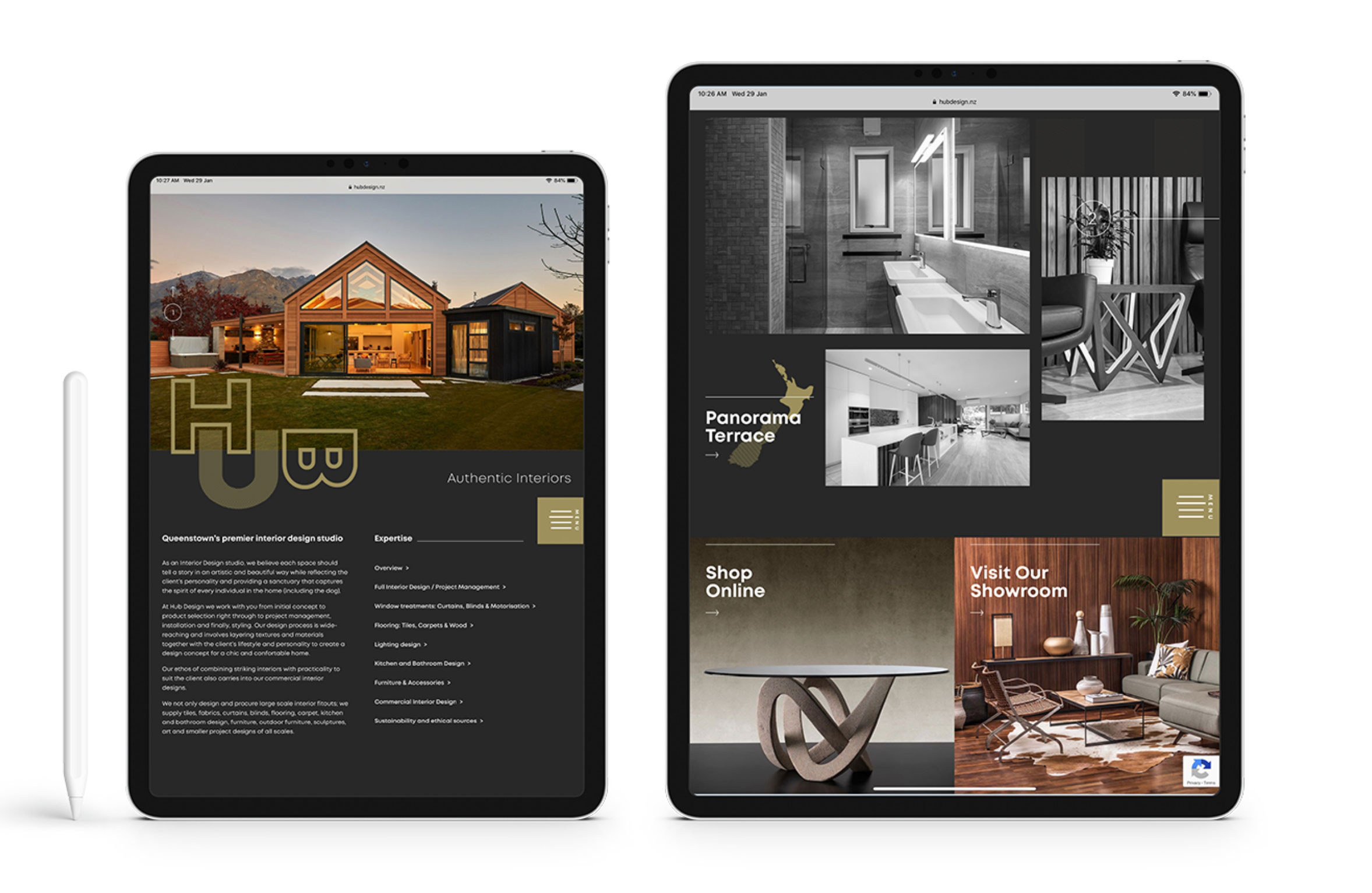
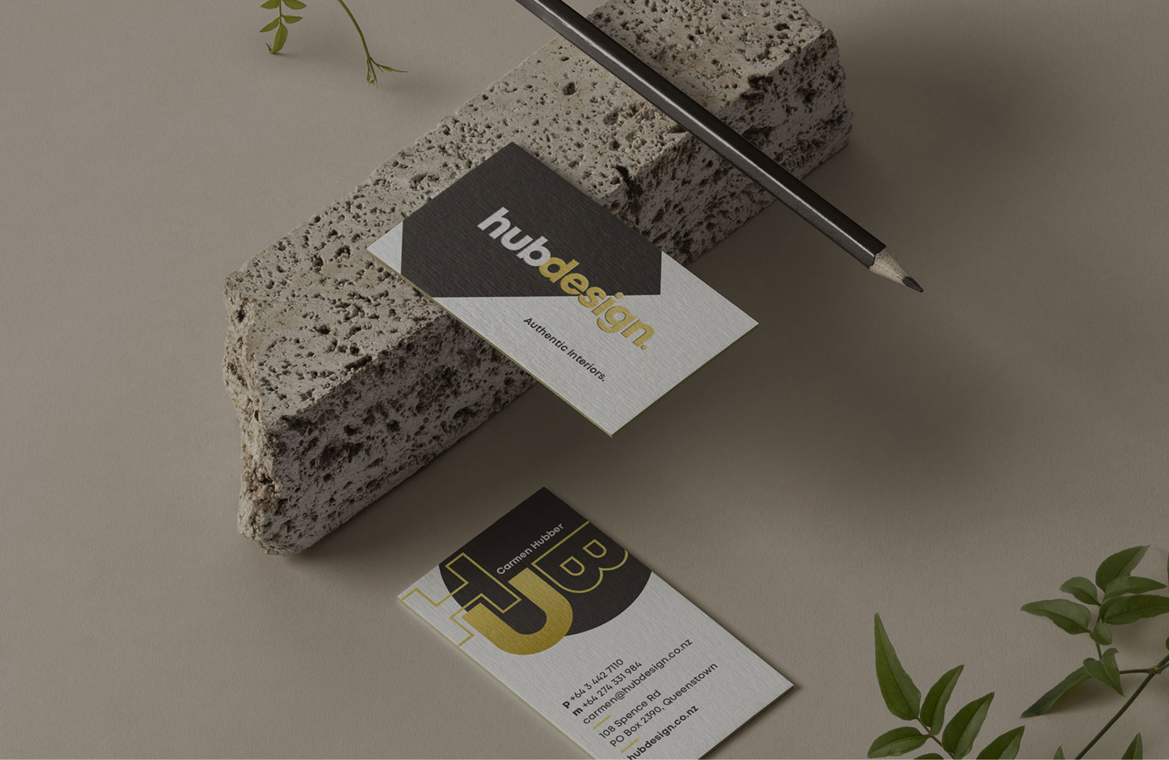
To further make a bold statement in the visual aspects of the brand and website we used a deep colour palette with a punch of gold.
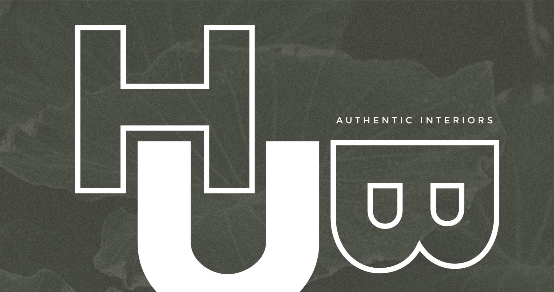
The only part of the brand we kept minimalist was the logo design. A colour break symbolises the combining of beauty and balance. A delicate modification on the ear and shoulder of letters “g” and “n” adds subtle character.
We designed a secondary graphical representation of “Hub” that can be used to make a bolder statement and still compliments the main logomark when used together. The mix of colours, textures and patterns make for a brand image as diverse and stylish as the homes Carmen designs.
Hub Design finally achieved a brand identity that not only represents the work she does, but also who she is as a designer. Authentic is such a powerful word in this case because it means true to self. A genuine brand for a genuine person. Now that’s a story people can really connect to.